

「たばこ」のレトロ看板文字によって制作する書体とその書体の視覚表現
Visual representation of the typeface and the typeface produced by the retro sign letters of "Tobacco."
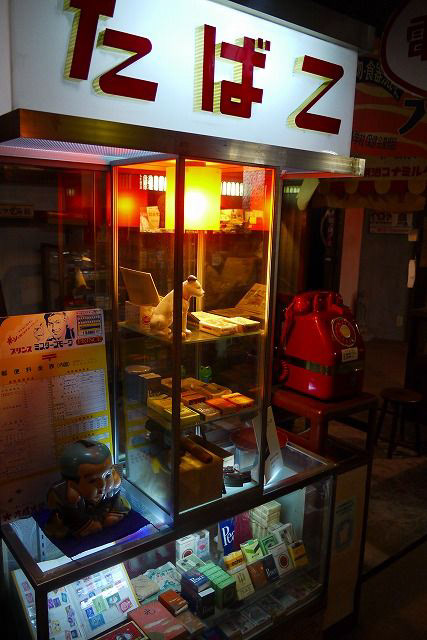

このプロジェクトのインスピレーションは、ある日街で見かけた「たばこ」の販売看板から来たものである。図に示すように、現在の簡潔な書体デザインとは異なり、この看板の書体スタイルはレトロで、多くの手書き書体の特徴を備えている。その後の作成過程では、見える3つの仮名のデザインの特徴を分析し、さらに平仮名と片仮名全体を広げ、実際のポスター作成に応用するようにした。
The inspiration for this project came from a "cigarette" sales sign that I saw on the street one day. As shown in the figure, unlike today's concise typeface designs, the typeface style of this sign is retro and has many handwritten typeface features. In the subsequent creation process, the design features of the three visible kana were analyzed and further expanded throughout the hiragana and katakana to be applied to the actual poster creation.

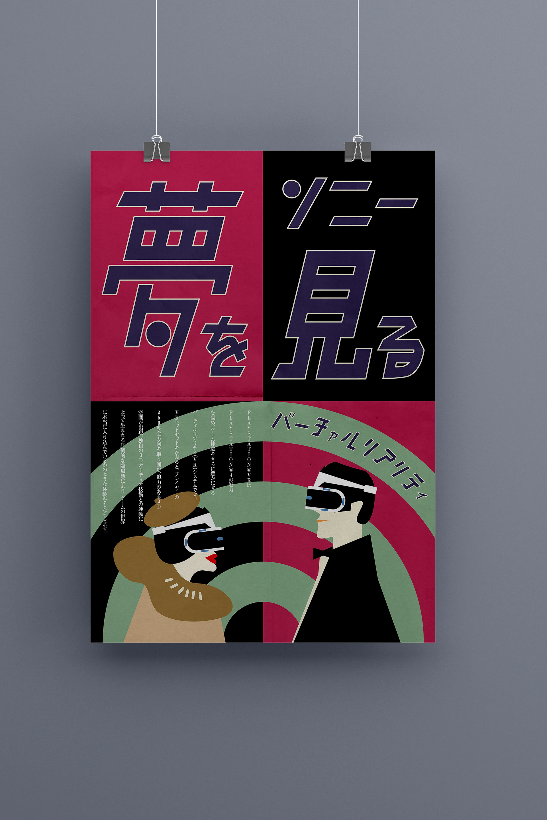
シリーズポスターのデザイン構想は:iPhone、VR設備などの現代の科学技術製品が前世紀2、30世代に設計されたと仮定し、製品は先進的であるが、宣伝ポスターのデザインスタイルは前世紀のレトロなスタイルに沿っている。そこで、ポスターの画面表現の中でレトロな書体と装飾スタイルで先進的な電子製品を表現して、時空上の視覚的な衝撃を生んで、興味深い視覚実験であると思う。
The design concept for the series of posters is: Assuming that modern technological products such as iPhone, VR equipment, etc. were designed in the second or third generation of the last century, the products are advanced, but the design style of the advertising posters follows the retro style of the last century. Therefore, the retro typeface and decorative style of the poster screen representation of advanced electronic products creates a visual impact in time and space, which is an interesting visual experiment.