
太湖科学城LOGO ------「自然和谐·科技融汇」整体设计思路是从「太湖科学城」的英文名「Taihu Science City」入手,提取了「太湖」、「科学」和「城市」三个关键词,并结合关键词和引申含义的特点以及主办方“创新智慧之城、开放共享之城、美丽人文之城”的宗旨进行构思和设计。
Taihu Science City LOGO ------ "Harmony of Nature - Integration of Science and Technology" is designed from the English name of "Taihu Science City", extracting the three key words "Taihu", "Science" and "City", and combining the characteristics of the key words and their derived meanings with the organizer's purpose of "City of Innovation and Wisdom, City of Openness and The concept and design were combined with the characteristics of the key words and their derived meanings, as well as the organizer's purpose of "City of Innovation and Wisdom, City of Sharing, City of Beauty and Humanity".
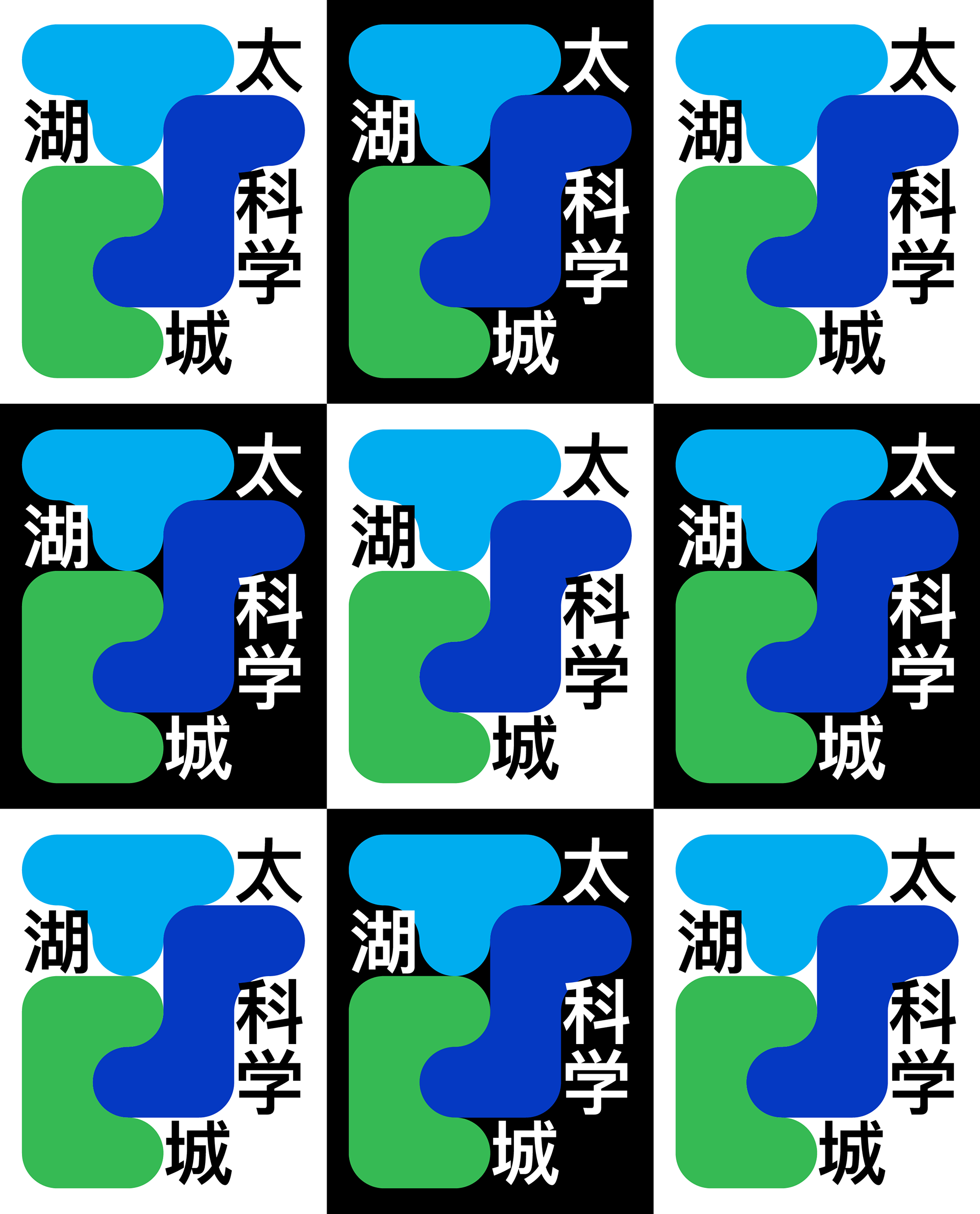
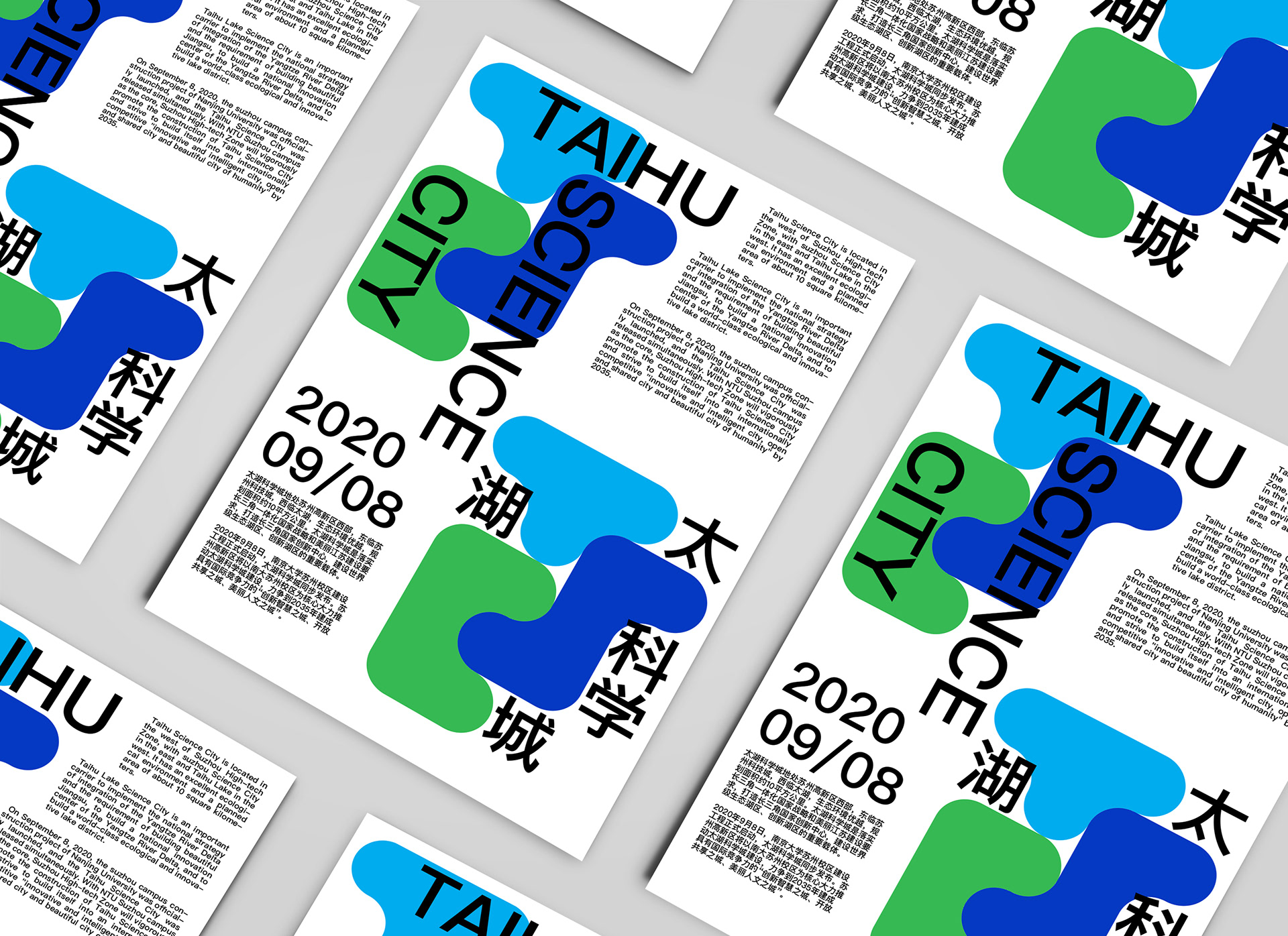
根据大量草图,最终确定了以英文名三个首字母大写的“T"、"S"、"C"所组成的LOGO方案,三个大写字母以 「榫卯拼接」的形式进行组合,象征着太湖所代表的“自然元素”与“科学技术”和“城市生活”的和谐共处,相互融合的寓意。在视觉上,通过三字母卯拼接的形式也使得LOGO更加完整与统一,也便于接下来的再设计与延展。
在确定主体图形方案后,结合科技城坐落于太湖湖畔,太湖水的柔美圆润的特点,同时联系到如今大量手机与电脑应用图标都采用圆角设计这一设计趋势,将原本的直角锋利的设计变更为更加现代,符合新时代审美特点的圆角方案,提升了LOGO的细节,也增加了亲近与科技之感。
Based on a large number of sketches, we finally decided on a LOGO scheme composed of three initial capital letters "T", "S" and "C", with the combination of three capital letters in the form of "mortise and tenon joint", symbolizing the harmonious coexistence and mutual integration of the "natural elements" represented by Taihu Lake with "science and technology" and "urban life". The three capital letters are combined in the form of "mortise and tenon joint", symbolizing the harmonious coexistence and mutual integration of "science and technology" and "urban life" represented by Taihu Lake. Visually, the three letters of the dashboard make the logo more complete and unified, and also facilitate the next redesign and extension.
After determining the main graphic scheme, combined with the Science and Technology City is located on the shore of Lake Taihu, the soft and rounded characteristics of Lake Taihu water, while linking to the design trend of a large number of cell phone and computer application icons are designed with rounded corners, the original right-angle sharp design changed to a more modern, in line with the aesthetic characteristics of the new era of rounded solutions, enhance the details of the LOGO, but also increase the sense of closeness and technology.
After determining the main graphic scheme, combined with the Science and Technology City is located on the shore of Lake Taihu, the soft and rounded characteristics of Lake Taihu water, while linking to the design trend of a large number of cell phone and computer application icons are designed with rounded corners, the original right-angle sharp design changed to a more modern, in line with the aesthetic characteristics of the new era of rounded solutions, enhance the details of the LOGO, but also increase the sense of closeness and technology.


在配色方面,根据「太湖」、「科学」和「城市」三个关键词,结合主办方提供的设计方案要求以及对于「太湖科学城」的定位于目标,选择了青、深蓝、绿色这三个颜色,每个颜色对应了每个关键词,三色结合也较为和谐,既突出了「自然(即太湖) 」、「科技」、「城市」各自的特点,也可以表达出三者相互融合,和谐共生的寓意。