

本LOGO的主题是一只栖身于竹林中的憨态可掬的熊猫形象。将代表四川成都的“川”字,与黑白极简进行创意的熊猫图案,以及代表“基地”环境的“自然与家”的绿色“竹林”形象相结合,既突出了位于四川成都熊猫基地的地理位置,同时采用几何构成的设计手法,将熊猫黑白色的特点以及“翠竹青葱”的要素相互融合,使最终呈现出的LOGO既简约而又寓意丰富。
在传统熊猫黑白两色搭配以提示LOGO内容与加深印象的同时,加入绿色元素使人不易产生视觉疲劳,也突出了研究基地集“科研”、“保护”、“教育”、“旅游”为一体,“人与熊猫与自然”三者和谐相处的理念。 作品应对设计定位、适用范畴及精神内涵等进行阐述; 主题突出、构图简练美观,不主张猎奇方式; 应具备独特性,易读易记易于识别和传播; 应易于延展,可举例展示LOGO作品在对不同场景、材料、制作条件下,相应的设计手段,兼顾不同的视觉传播方式。
The theme of this LOGO is the image of a cute panda in a bamboo forest. The combination of the word "Chuan", which represents Chengdu, Sichuan Province, with the black and white minimalist panda design and the green color of "nature and home", which represents the environment of the "base". The combination of the "bamboo forest" image not only highlights the geographical location of the Chengdu Panda Base in Sichuan, but also adopts the geometric composition design technique to integrate the black and white characteristics of the panda and the "green bamboo" elements, so that the final LOGO presented is both The final logo is simple and rich in meaning.
While the traditional black and white colors of the panda are used to suggest the content of the LOGO and deepen the impression, the addition of green elements makes it less likely to produce visual fatigue, and also highlights the research base's integration of "scientific research", "conservation", "education" and "tourism". It also highlights the concept that the research base integrates "scientific research", "conservation", "education" and "tourism" into one, and that "man, panda and nature" live in harmony. The work should elaborate on the positioning, scope of application and spiritual connotation of the design; the theme should be prominent, concise and beautiful in composition, and not advocate a hunting approach; it should be unique, easy to read, easy to remember, easy to identify and spread; it should be easy to extend, and examples can be given to show the corresponding design means of the LOGO work under different scenes, materials and production conditions, taking into account different visual communication methods.
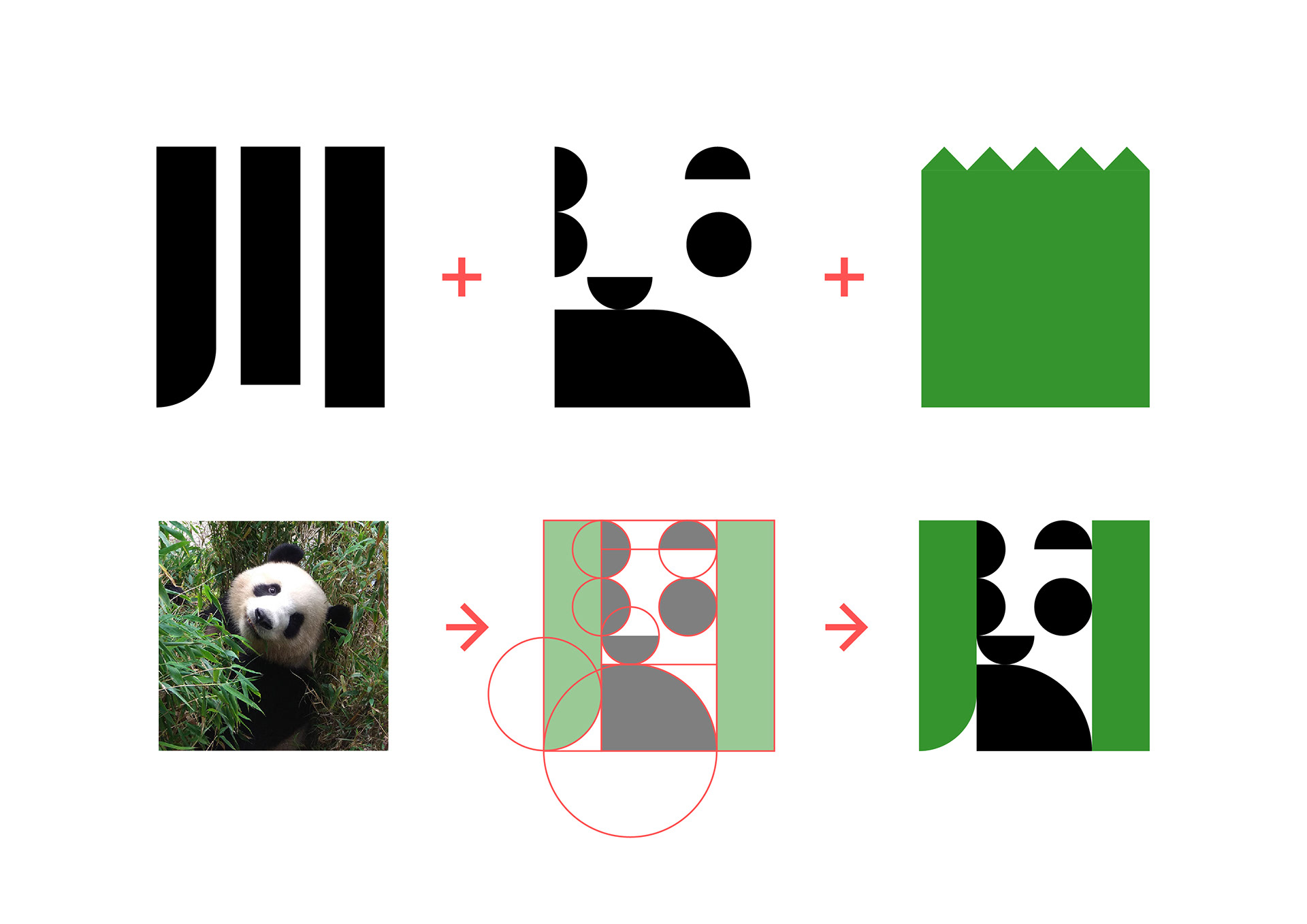
通过思维导图提取关键词,最终锁定在“成都”“大熊猫”“基地”三个方向,并且进一步进行了图像创意,最终将代表四川成都的“川”字,与黑白极简进行创意的熊猫图案,以及代表“基地”环境的“自然与家”的绿色“竹林”形象相结合,设计出最终的主LOGO形象。
The keywords were extracted through the mind map and finally locked in the three directions of "Chengdu", "Giant Panda" and "Base", and the image was further creative. "The "Chuan" character representing Chengdu, Sichuan, was combined with the black and white minimalist panda pattern and the green "bamboo forest" representing the environment of the "base". The final main LOGO image was designed by combining the "Chuan" character representing Chengdu, Sichuan Province, with the black and white minimalist panda pattern and the green "bamboo forest" representing "nature and home" in the "base" environment.
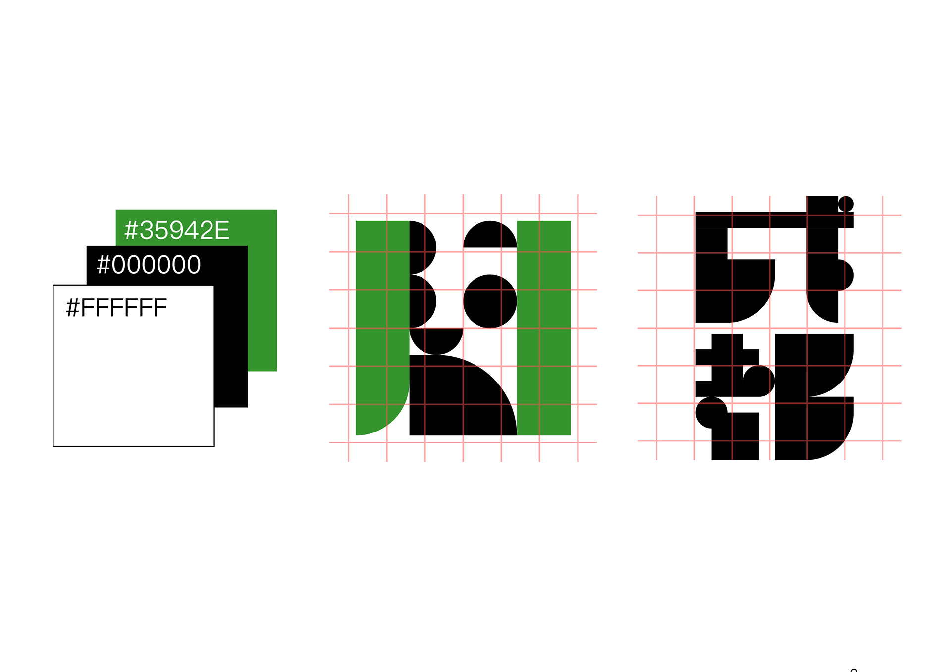
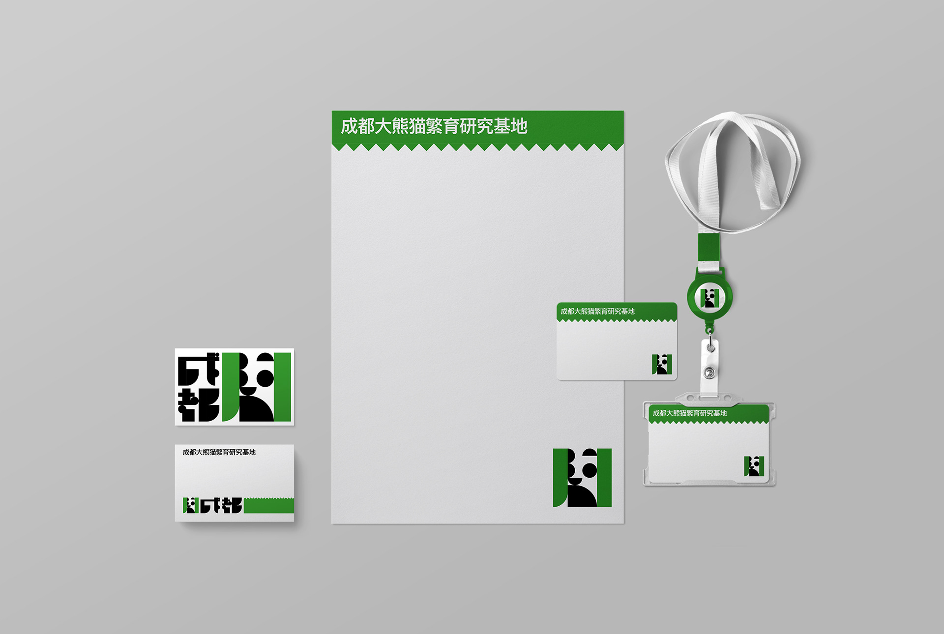
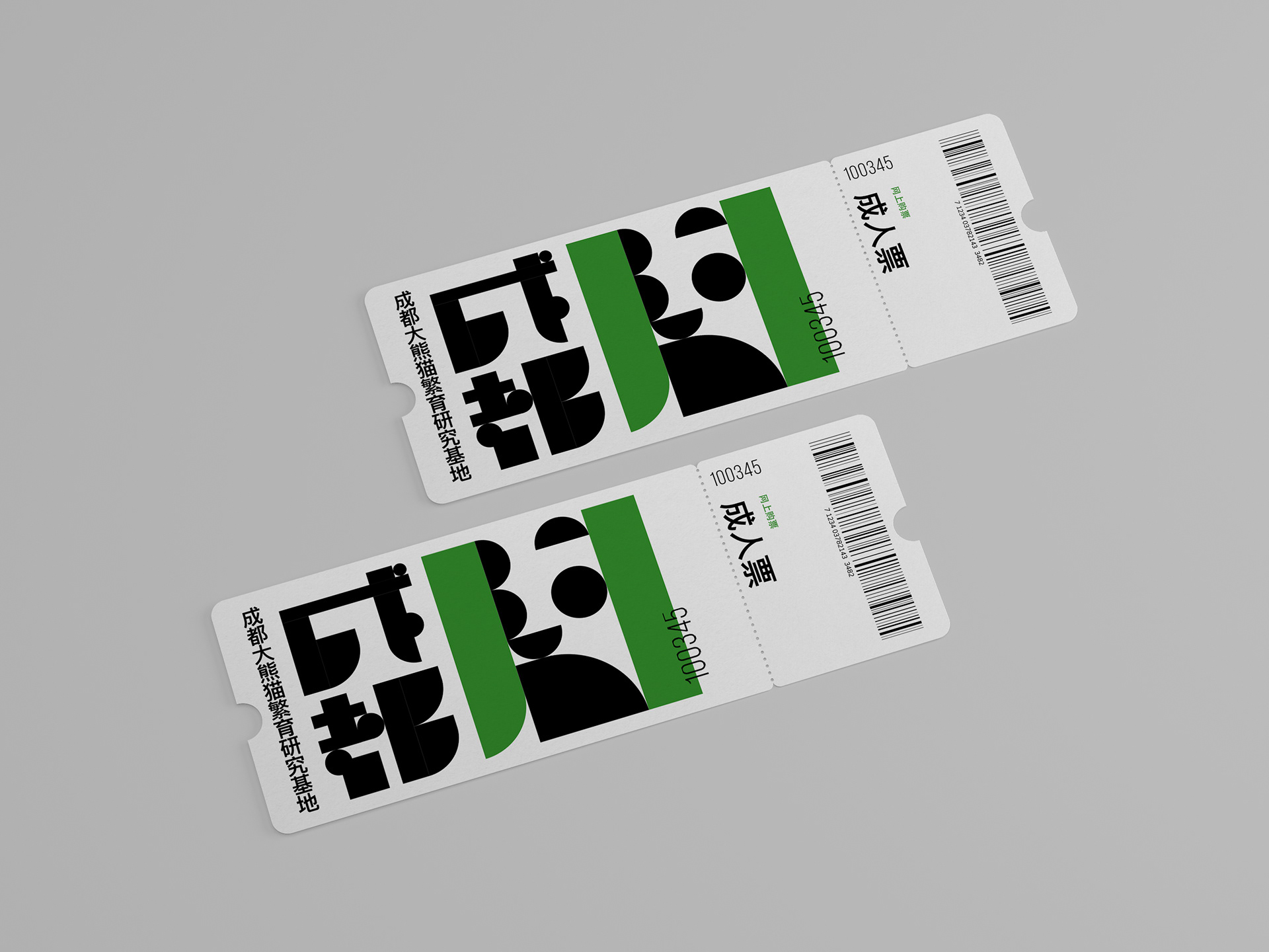
LOGO的颜色采用了“黑”“白”“绿”三种基本色组成。简洁概括了熊猫(黑白)与竹子(绿)的意象。同时根据主LOGO的风格又进行了辅助图形与字体以及图案的相关设计,这里仅简单举例示意,后期可根据具体需要逐步扩充完善。
The color of the LOGO is composed of three basic colors: "black", "white" and "green". The image of panda (black and white) and bamboo (green) is concisely summarized. At the same time, according to the style of the main LOGO and auxiliary graphics and fonts and patterns related to the design, here is only a simple example, later can be gradually expanded according to the specific needs of the perfect.