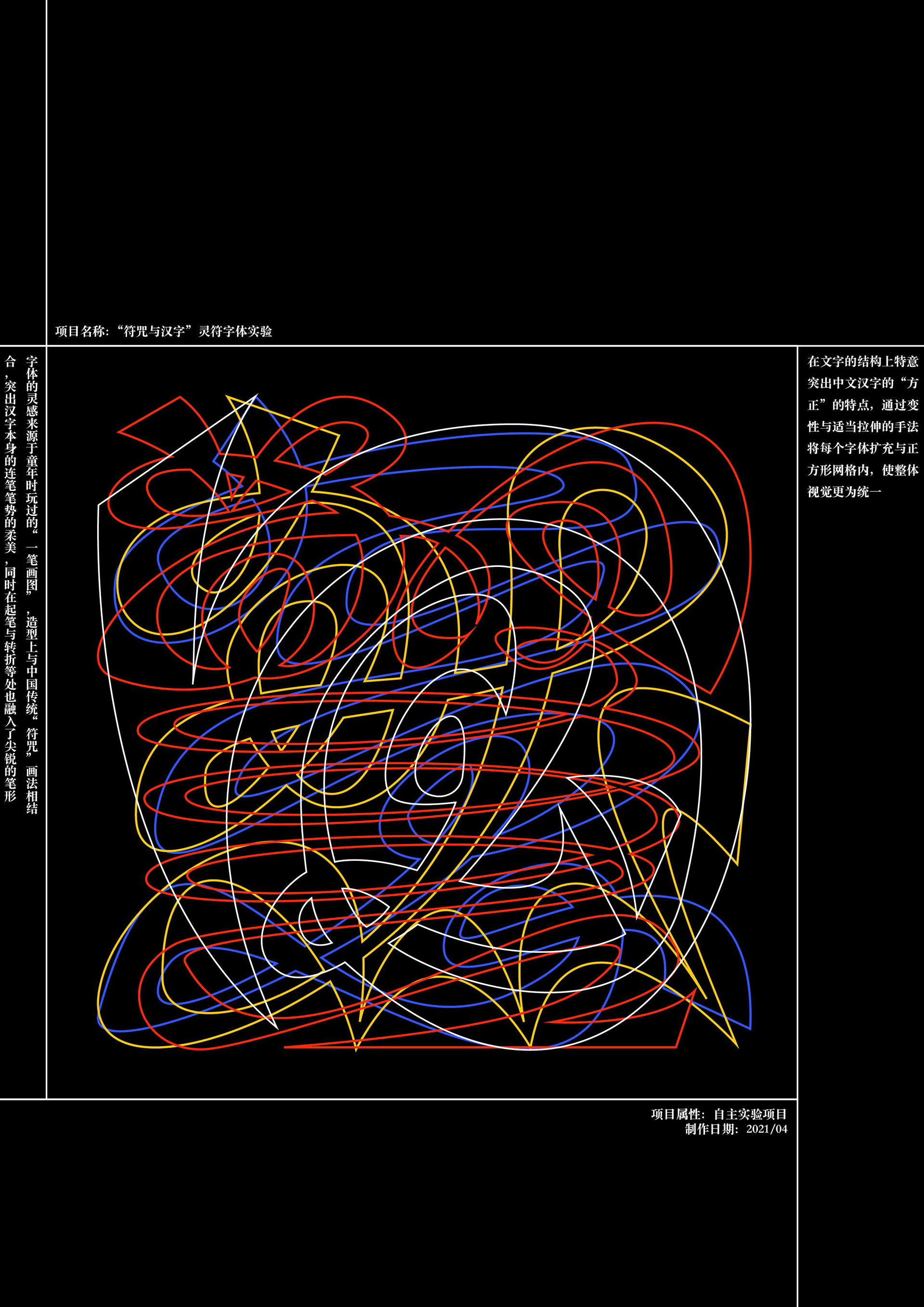


字体的灵感来源于童年时玩过的“一笔画图”,造型上与中国传统“符咒”画法相结合,突出汉字本身的连笔笔势的柔美,同时在起笔与转折等处也融入了尖锐的笔形。在文字的结构上特意突出中文汉字的“方正”的特点,通过变性与适当拉伸的手法将每个字体扩充与正方形网格内,使整体视觉更为统一。整体造型上,确定“以画御字”的设计思路,既保留了文字必要的辨识度,又将一些笔划与连笔草书相结合,删繁就简,让整体视觉同时具备灵动柔美与醒目简洁之感。
The inspiration of the font comes from the "one stroke drawing" that we used to play with in our childhood, and the shape is combined with the traditional Chinese "charm" drawing method, highlighting the softness of the Chinese character itself, while incorporating sharp strokes in the starting and turning points. The structure of the characters highlights the "square" character of Chinese characters, and each character is expanded within a square grid by means of variability and appropriate stretching, making the overall visual unity. In terms of overall shape, the design idea of "using painting to control characters" is determined, which not only retains the necessary recognition of the characters, but also combines some strokes with continuous cursive script to simplify the overall visual sense of both flexibility and striking simplicity.